Resources
Build a first menu people can understand
A practical paper test for categories, descriptions and the moment a customer chooses.
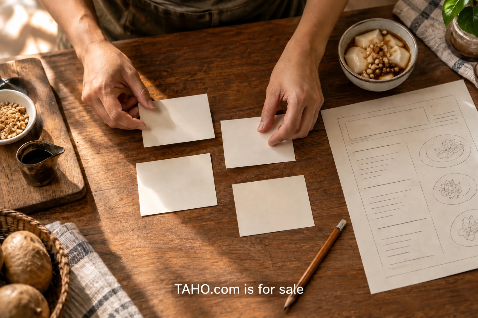
Your first menu needs to help someone make a choice while also giving the team a manageable service. It is tempting to begin with a list of everything the kitchen could make. A more useful starting point is the conversation at the counter: what does the customer need to know, what can they choose and what happens after they order?
This exercise is for a small food concept preparing an opening menu. It uses an imaginary dessert counter as a worked example, but the method can be adapted to a café, bakery or limited pop-up. The output is a paper menu you can put in front of five readers before committing to a printed board or a full digital design.
Write the offer in one ordinary sentence
Describe the food and the occasion without writing a slogan. “Three dessert cups, assembled to order, with one standard size” gives a team something to work with. “A world of delicious possibilities” leaves every important decision open. The sentence is for planning; it does not have to appear at the top of the final menu.
Now list the choices that sentence creates. Does a customer select a flavor, size, temperature, topping or collection time? Put each on a separate line. If there are five decisions hidden inside one product, the menu needs to make their order clear. Some choices may be better settled by the concept itself, especially for a first service.
Ask the operator to review the list before refining the words. A choice that sounds simple to the customer may require a different container or preparation step. The menu should reflect what the team can actually deliver. Copywriting cannot solve an offer whose options are still changing every day.
Give each item a different job
For the example counter, imagine a standard cup, a toasted-topping cup and a seasonal cup. Write a short description for each, then underline the words that distinguish them. If nearly all the underlined words are adjectives such as lovely, rich or special, the differences may not be clear enough.
A useful description identifies the main components and the meaningful variation. The standard cup establishes the reference. The toasted version tells the reader what is added or changed. The seasonal version names its current feature. Avoid making a person compare three long ingredient narratives just to discover that only one topping differs.
Keep optional extras separate from the main products. Mixing extras into the same list can make a small offer look much larger than it is. A reader should be able to tell whether a line describes a complete serving or an addition. Use a plain heading if that distinction is not immediately obvious.
Put information where the decision happens
Write down the questions a first-time customer is likely to ask. What is included? How large is it? Which choices change the price? Where do I order? Your working menu can answer these close to the relevant item. There is no benefit in making someone search a distant footnote for the detail they need to choose.
For the paper test, use hypothetical internal price markers if pricing is unresolved, clearly labeled as draft. Before any real menu is published, the operator must set and verify its actual prices and required information. Keep planning placeholders out of public materials. A beautiful board is still unfinished if the team cannot explain what an order includes.
Food descriptions should be checked against the actual recipes. Direct ingredient or dietary questions to the responsible team and qualified advisers when needed. Do not turn a casual copy edit into an assurance about allergens or suitability. The test described here is about comprehension, not a substitute for the food business’s operational responsibilities.
Build a hierarchy before choosing a typeface
Use plain paper and one ordinary font. Put the main categories at the top level, product names beneath them and supporting details one step smaller. If the page only works after adding several decorative typefaces, the structure probably needs another pass. The reader should be able to see what belongs together before appreciating the visual style.
Try the menu at the size it will actually be read. A desktop preview of a counter board can hide small text and crowded spacing. Print a rough version and stand where a customer would stand. For a handheld menu, hold it at a comfortable reading distance. For mobile, open a basic page on a phone instead of shrinking a screenshot of the board.
Digital menu text should remain actual text where possible. The W3C explanation of images of text describes the accessibility reasons for allowing text to adapt to a reader’s needs. A photograph of a menu board can be useful context, but it should not be the only way to find out what is served.
Run a short test with five readers
Choose people who are reasonably close to the intended customer, including someone unfamiliar with the food. This is a small exploratory exercise, not statistical proof of demand. Tell each person that the menu is being tested, not their ability to understand it. Ask them to imagine ordering one item and explain how they would choose.
Give the reader the page before describing the concept. Watch where they begin, what they compare and where they pause. Resist the urge to explain a line as soon as they hesitate. That moment is useful evidence that the wording or structure may need work. You can answer questions after the first attempt.
Ask three concrete follow-ups: what would arrive with your choice, what other decision would you need to make and where would you go next? Write down their words. “I thought this was a drink” tells you more than a rating of seven out of ten. Keep notes anonymous unless there is a real reason to retain identifying details.
Separate patterns from preferences
One reader may dislike a product name while still understanding it perfectly. Another may praise the design but misunderstand the contents. Record these as different kinds of feedback. Comprehension problems affect the menu’s job; personal taste may be worth considering but does not automatically require a redesign.
Make a simple review sheet with the menu line, observed question and proposed change. If several people ask whether the topping is included, put that answer directly into the description. If everyone understands the items but cannot find collection information, change the ordering instructions. Avoid rewriting the entire menu in response to a single unclear phrase.
Run a second short check on the changed section. You do not need to restart every discussion if only one description changed. Ask a fresh reader to explain that item and see whether the original confusion remains. Keep the earlier draft so the team can see what was learned and why the new version is different.
Hand over a usable menu file
Once the structure works, let the designer bring in the brand’s typography, color and spacing. Supply the agreed text as a separate document, with the category levels clearly marked. Include the intended dimensions and a list of where the menu will appear. A website, window poster and delivery insert may need different layouts while keeping the same product information.
Assign someone to own updates. When a recipe, price or item changes, the board and the online menu should be reviewed together. Keep a dated master copy rather than letting several nearly identical files circulate. The first successful test is a starting point for that maintenance habit.
Your next step is deliberately modest: write the offer sentence, draft the item hierarchy and print one page. Five conversations can then show where the offer needs clearer words or fewer decisions. The goal is a menu that helps a person order with confidence and helps the team deliver exactly what was understood.

About Michael Santiago
Founder, PremiumBrands.com / OnlineBusiness.com
Michael Santiago acquired i-Newswire.com in 2007, progressing to iNewswire.com and Newswire.com: a short, category-defining brand. The business sold to Issuer Direct for $44 million in 2022. He now develops premium domains and companies through OnlineBusiness.com.