Ideas · An illustrative concept
A modern taho counter
A focused dessert counter, from the first three menu choices to a calmer handoff.
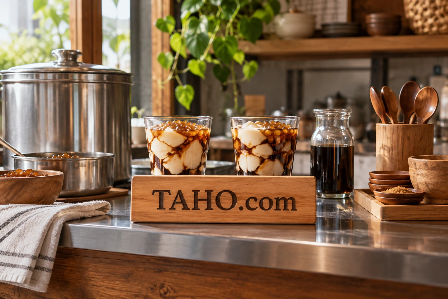
A good first version of a taho counter could fit on one sheet of paper. What is served, how a customer chooses it, where the cup is finished and who hands it over should all be clear before anyone starts designing a second location. This is an illustrative business concept for a prospective TAHO.com buyer, with a deliberately small opening offer.
The customer might be someone who already loves the dish and wants a dependable stop on the way to work. Another might be trying it for the first time and looking for a little guidance. Those two people need different amounts of explanation, but both should be able to order comfortably. The counter can make room for that through a clear menu and a patient service rhythm.
Give the first offer a boundary
Start the concept with one standard cup and two variations that share most of the preparation. The standard cup becomes the reference point for the menu and the photographs. Each variation should change something a customer can describe, such as a topping or syrup, rather than adding an entire new preparation station. The exact recipes would come from the people developing and testing the food.
Write the standard cup description in ordinary language. List what is included, indicate the size and explain any choices the customer must make. A newcomer should not have to decode a poetic product name to find out what will arrive. A familiar customer should be able to scan the same board quickly and confirm an order.
Keep an ideas list outside the opening menu. A proposed drink, seasonal topping or gift box can live there until the team knows what the first service actually requires. Saying yes to an idea later is easier than removing an item that customers have already started asking for. This also gives the founder a way to listen without promising every suggestion immediately.
Design the handoff alongside the cup
Imagine the counter from the customer’s side. The menu should be visible before the ordering point. The finished cup should have a clear collection place. Napkins and utensils should be reachable without sending someone back through the queue. These are design decisions that can be tried with paper signs and empty containers before investing in joinery.
From the staff side, draw the order of movements. Where are cups stored? Where does a topping get added? Where does the completed order wait? A sketch can reveal that two people need the same narrow patch of counter at the same moment. Moving a shelf on paper costs much less effort than discovering the conflict during an opening shift.
This drawing is an operational starting point, not a food handling plan. The operator would need qualified local advice, suitable equipment, tested recipes and the approvals appropriate to the location. Set aside a separate workstream for those requirements so a polished visual concept does not get mistaken for readiness to serve.
Use the name where people make contact
TAHO.com could connect the counter sign, cup sleeve and online menu through one consistent address. For this concept, its fit comes from the product focus and the opportunity to keep the digital destination aligned with the name on the counter. The website could initially show the menu, location, hours and practical ordering information.
A product photograph should explain the actual serving. Show the cup that would be handed over, with an honest sense of scale. The concept artwork on this page imagines an identity; an operating business would replace it with photographs of its own tested product. The W3C images tutorial also provides useful guidance for giving informative website images a text alternative, so the menu remains understandable beyond the photograph.
Try one credible route to customers
A limited pop-up inside a suitable existing venue could be a way to test the proposition, subject to the necessary arrangements and approvals. The point of the pilot would be to learn from a bounded service, not to create the appearance of a chain. Agree who handles ordering, where the counter sits, how visitors find the offer and what happens when the available servings run out.
Create one invitation that leads to a simple information page. It should answer when, where, what is being served and how the event works. Afterward, record the questions people asked before ordering. If several people could not tell the difference between two menu items, revise the descriptions before adding another option. If pickup caused confusion, change the sign and test the route again.
Leave the pilot with a useful decision
A one-counter pilot can finish with a short review: which preparation steps slowed the team, which descriptions caused hesitation, what customers expected from the cup and whether the venue suited the offer. Keep observations separate from interpretations. “Four people asked where to collect” is more actionable than “the service felt confusing.” The next version can then address a specific problem.
Before pursuing this direction, sketch a counter, draft three menu lines and ask a potential operating partner to challenge the sequence. Add a rough responsibility list covering product, service, location and customer communication. If TAHO.com fits the venture you want to build, use the inquiry form to discuss acquiring the domain or to outline a partnership proposal. Additional brand or website assets would be subject to agreement.

About Michael Santiago
Michael Santiago started i-Newswire.com in 2007, progressing to iNewswire.com and Newswire.com: a short, category-defining brand. The business sold to Issuer Direct for $44 million in 2022. He now develops premium domains and companies through OnlineBusiness.com.